In the course of my perceptual studies on near-eye displays, I needed to use the famous font developed by Dutch ophthalmologist Herman Snellen, who developed his chart in 1862. While there are a few versions (link1, link2) floating around the internet, I felt that none of them met all my requirements while staying faithful to the principles the font was based on. The 5×5 grid which served as a basis for the font was essential, as was maintaining the width of all gaps and lines, no matter what angle or curvature they expressed. Additionally, I required numbers and a limited set of mathematical symbols which met the same criteria. So I modified the Andrew Howlett version (link1). I think the results look good, but will probably tweak the 5 to have a larger bottom gap to differentiate more from the 6 and possibly do something about the top of the G:

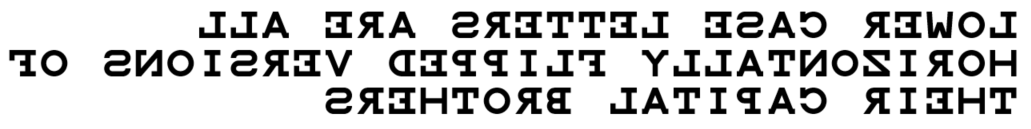
Seeing as lower case letters are ill defined in the 5×5 grid and most would present problems, it has a solution which Andrew came up with and I agree with: all the lower case letters are horizontally flipped versions of the capitals:
Download links:
Snellen.sfd
Snellen.ttf
Additionally, I will soon be adding a font for the much improved and newer optotype from the logMAR charts as soon as it is complete.